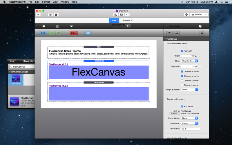
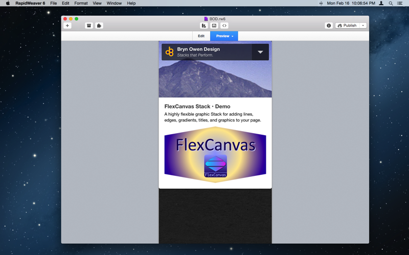
FlexCanvas Stack
A highly flexible graphic Stack for adding lines, edges, gradients, titles, and graphics to your page.
How does it work?
The HTML canvas element is used with javascript to draw shapes, etc.
Parameters | |
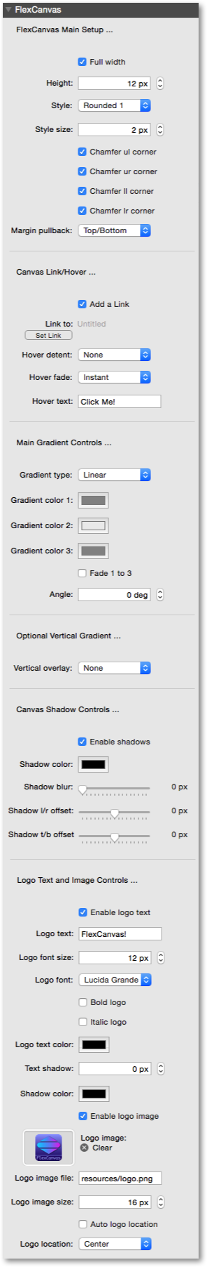
| Full width | Canvas will resize responsively to match the full width of its container div when enabled, otherwise specify a width in pixels below. |
| Width | Specify the exact width of the canvas in pixels when Full width is not used. |
| Height | Specify the exact height of the canvas in pixels. |
| Align | When the canvas is drawn with a fixed width you can select whether to center, left, or right justify it within the main div. When the full width (responsive) is used then justification is not used. |
| Style | Select the type of rule shape and chamfer type. Use the Style size to further control the results. Experiment with this selection to get the right style: some Styles are useful abutted to other stacks; some Styles are useful when abutted to other FlexCanvases; some Styles are best standalone with plenty of space to nearby stacks. |
| Style size | Use this setting to scale the Style chamfers and other aspects of the selected Style. This may be used on some Styles to change other dimensions - experiment for good results. Use the corner chamfer enables below for more control ... |
| Chamfer ul corner | Certain Styles can have the upper-left corner chamfer enabled and disabled with this option, to allow this stack to be abutted with other stacks or for artistic effect. |
| Chamfer ur corner | Certain Styles can have the upper-right corner chamfer enabled and disabled with this option, to allow this stack to be abutted with other stacks or for artistic effect. |
| Chamfer ll corner | Certain Styles can have the lower-left corner chamfer enabled and disabled with this option, to allow this stack to be abutted with other stacks or for artistic effect. |
| Chamfer lr corner | Certain Styles can have the lower-right corner chamfer enabled and disabled with this option, to allow this stack to be abutted with other stacks or for artistic effect. |
| Margin pullback | Enable this to reduce the main div margin by 1px on the selected sides to make FlexCanvas overlap/merge with adjacent Stacks. This makes it blend nicely with neighboring Stacks by eliminating rounding effects on div sizes, but this may not always be desirable in which case you can disable this to return margins to defaults using None. |
| Add a Link | Check this to add a link to the canvas. |
| Link to | Set a link to jump to when the canvas is clicked. |
| Hover detent | Shrink the canvas by this amount when hovering the mouse over it to get a depressed effect. |
| Hover fade | Choose a hover fade speed to slow the transition to the detent size. |
| Hover text | Optional logo text when hovering. It is best to keep this short! Leave it blank for no change. |
| Gradient type | Select the type of gradient. Linear gradients have control over Angle, while Radial gradients can be centered anywhere in the canvas using Offset controls. |
| Gradient color 1 | Left most gradient color. This is always opaque, although the other two colors may be set to fade to transparent with Fade 1 to 3 below. |
| Gradient color 2 | Middle gradient color. This is opaque unless Fade 1 to 3 is checked below. |
| Gradient color 3 | Right most gradient color. This is opaque unless Fade 1 to 3 is checked below. |
| Fade 1 to 3 | Check this to fade transparency on gradients 1, 2, 3: 1=opaque, 2=50% transparent, 3=100% transparent. Use Angle below to reverse this order if necessary. |
| Angle | Gradient angle in degrees, where 0=left to right, 90=top to bottom, 180=right to left, 270=bottom to top, 360=0 again. |
| Offset in x | Gradient horizontal center offset as a percentage of width: 0=left edge, 50=center, 100=right edge. |
| Offset in y | Gradient vertical center offset as a percentage of height: 0=top edge, 50=center, 100=bottom edge. |
| Vertical overlay | Choose a vertical overlay gradient to fade the underlying gradient. Choose only from top-bottom fades to white or black. |
| ... Other Color | Choose a custom color to terminate the vertical overlay gradient fade selected above. |
| ... Other Color | Choose a custom color to terminate the vertical overlay gradient fade selected above. |
| Enable shadows | Check this to enable shadow controls below ... |
| Shadow color | Color of drop shadow. Fade this color to dim the shadow instead of using blur below. |
| Shadow blur | Size of shadow blur in pixels. 0 is sharp and not blurred. |
| Shadow l/r offset | Shadow horizontal offset in pixels. |
| Shadow t/b offset | Shadow vertical offset in pixels. |
| Enable logo text | Check this to add a text logo inside the rule ... |
| Logo text | Logo text. It is best to keep this short! Hover can have another string above. |
| Logo font size | Set the font size of the logo text in pixels. |
| Logo font | Choose a font for the logo text, or select Other and provide your own font. |
| Other font | Select another font to use for the body text. |
| Bold logo | Check this to select a bold font. |
| Italic logo | Check this to select an italic font. |
| Logo text color | Logo text color. |
| Text shadow | Logo shadow is to the lower right. |
| Shadow color | Logo text shadow color. |
| Enable logo image | Check this to add a logo image inside the rule ... |
| Logo image | Drop a logo image (a small png works best) here and it will be used instead of the resource/file specified below. Use Logo size below to scale the image. Leave this blank if you want to specify the logo as a file name below. |
| Logo image file | Specify an exact path to a logo image file, such as resources/logo.png. Use Logo size below to scale the image. Leave this blank if you want to drop a logo image in the Logo image well above. |
| Logo image size | Set the size of the image in pixels. Logos work best when kept under 128px and are square. Shadows and borders should be created inside the logo image, so controls are not provided for those features here, sorry. |
| Auto logo location | Check this to place logo text and/or image automatically at a location appropriate for the selected Style above. |
| Logo location | Select predefined logo locations over the canvas, or choose Manual to specify your own location using the x/y percentages below ... |
| Logo x loc | Logo center x location as a percentage of width: 0=left edge, 50=center, 100=right edge. This is ignored when Auto logo location is selected. |
| Logo y loc | Logo center y location as a percentage of height: 0=top edge, 50=center, 100=bottom edge. This is ignored when Auto logo location is selected. |
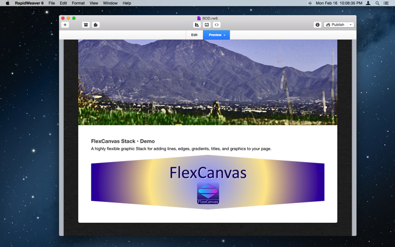
Check out examples of FlexCanvas below - this stack can be used for just about ANYTHING, so the examples below are just hints for you to go on …
Example 1: FlexCanvas as a simple replacements for <hr> of fixed and responsive widths …
Example 2: use FlexCanvas to create standalone shapes, or add edges to other Stacks …
Example 3: gradients are available on all shapes, in two or three colors …
Example 4: on any gradient you can overlay a fade to white or black or any other color on top or bottom, to blend FlexCanvas into its surroundings …
FlexCanvas Info
FlexCanvas Features
- Responsive
- Requires JS, HTML5
- Sparkle updates
Purchase FlexCanvas
- $5 USD via PayPal
- Immediate download *