
LinkList Stack
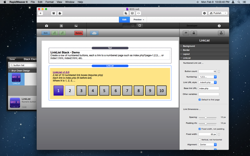
Create a row of numbered buttons, each a link to a numbered page such as index.php?page=1,2,3,… or index1.html, index2.html, etc.
How does it work?
Buttons and links are generated with PHP code and one is selected based on the current page parameter or url.
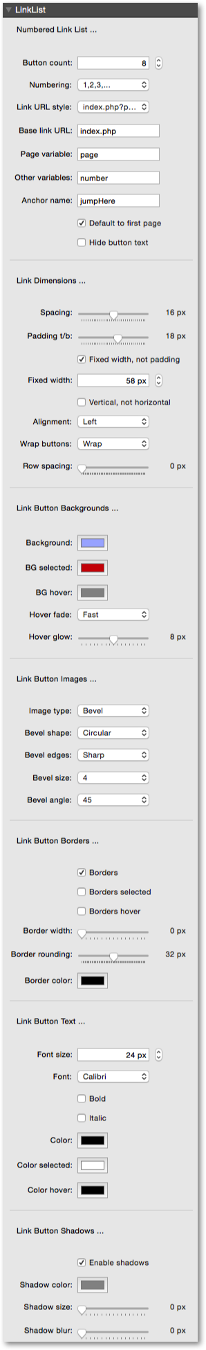
Parameters | |
| Button count | The number of buttons (and links) that will be generated. |
| Numbering | Choose the sequence of numbering for the buttons. When using lettering, please use 26 or fewer buttons. |
| Link URL style | Choose the style of link url to generate for each button. Each link can reference a different page numbered from 1..N, or a common page that is passed an index argument in the url such as page=1..N (GET). |
| Base link URL | This is the URL of the base link from which all button links are created. Depending on the link style selected above, the resulting button links will be this link with a page variable appended, or the page number inserted into the link just before the extension. Other variables may be appended as a suffix using the option below. |
| Page variable | This is the name of the page variable used as a GET argument in the URL. You could use the PostSwitch stack in your page to select what to display for each page index value passed. |
| Other variables | This suffix will be added to the end of each link, by following the page variable with ampersand. |
| Anchor name | Enter a unique name for an anchor to create inside this Stack and to jump to using #anchor at the end of each button URL. This is useful for ensuring this Stack scrolls into view when the page is loaded from a button click. This is optional and may be left blank if anchors are not needed. |
| Default to first page | Check this to indicate that the base page does not need to be named index1 or be passed page=1 etc. to be selected by default. So when all else fails the first button will be highlighted/selected. Otherwise when this is not checked, the default behaviour is that the first button is only shown in the selected state when the url or page index matches, so the Stack will usually start out with nothing selected, all buttons in the same unselected state. |
| Hide button text | Check this to hide the text on each button. This may be useful when button images are used or when you simply do not want the text visible. |
| Spacing | Spacing between link boxes in px. |
| Padding t/b | Internal padding from link numbers to surrounding border on the top/bottom. |
| Fixed width, not padding | Check this to set the link button width in px instead of variable based on content. |
| Padding l/r | Internal padding from link numbers to surrounding border on the left/right. |
| Fixed width | Fixed width in px of link buttons instead of using text with padding, resulting in buttons whose width changes with the font, the number of digits etc. |
| Vertical, not horizontal | Check this to create a vertical column of buttons instead of the default horizontal row. |
| Alignment | Align buttons within their overall div. |
| Wrap buttons | If buttons fill more than the available width, choose how to display them: wrap buttons onto new rows, or scroll horizontally all buttons in single row. |
| Row spacing | Extra spacing between rows of buttons when Wrap buttons is set to Wrap, and also bottom margin to leave space for the scroll bar when Wrap buttons is set to Scroll. When direction is vertical this is additional spacing added vertically between buttons. |
| Background | Background color of all links. |
| BG selected | Background color of selected/current link. |
| BG hover | Background color when hovering over link. |
| Enable gradients | Check this to enable gradients on button faces. Buttons are flat when this is not checked. Note that background images disable gradients, so you may only use one or the other, not both. |
| Gradient style | Choose a button gradient style: this is a gradient style, white/black color, and intensity or opacity. Experiment with this and your Link Background colors to get the right effect. When button images are enabled this option has no effect. |
| Hover fade | Choose a hover effect: fade the button to the hover colors, or instantly change. |
| Hover glow | When hovering over each button, surround with an outer blur effect using the shadow color. Drop shadow disables momentarily while hovering. |
| Image type | Choose a background image style or none for simple colored buttons. Image = drop in a custom image here and it will be applied as the background for all buttons; Bevel = select a transparent bevel to overlay on buttons, giving them a 3D appearance. |
| Background image | Drop an image (png works best) here and it will be applied as the background to all buttons. |
| Bevel shape | Choose the shape of the bevel overlay that best matches your button shape, taking border rounding into account. Choose the Rectangular shape for most buttons with little or no border rounding; choose the Rounded shape when your border rounding is significant; choose the Circular shape when your button is perfectly circular (rounding is half of width and height). |
| Bevel edges | Choose the edge bevel effect. Soft is a rounded bevel while sharp is a linear flat bevel. |
| Bevel size | Choose the depth of the bevel. Smaller numbers are less visible while larger numbers give a deeper 3D feel. |
| Bevel angle | Choose the angle from where the lighting originates, casting a shadow on the opposite side. Angles are measured in degrees counter-clockwise (0 is on the right), so 45 is upper right, 135 is upper left, and so on. |
| Borders | Check this to enable borders on links. Borders are always present even when this is disabled, in order to allow for the zero padding case, and selection and hover effects, but the border color is set to match the background color. To completely remove borders set the Border width option below to zero as well. |
| Borders selected | Check this to enable borders on the selected/current link. |
| Borders hover | Check this to enable borders when hovering over links. |
| Border width | Border width added around all links, even when borders are disabled. |
| Border rounding | Border radius in pixels. |
| Border color | Border color of all links. |
| Border selected | Border color of selected/current link. |
| Border hover | Border color when hovering over link. |
| Font size | Set the font size of the link text in pixels. |
| Font | Choose a font for the link button text, or choose Other and specify your own font below. |
| Other font | Select another font to use for the body text. |
| Bold | Check this to select a bold font. |
| Italic | Check this to select an italic font. |
| Color | Text color. |
| Color selected | Text color for selected/current link. |
| Color hover | Text color when hovering on link. |
| Enable shadows | Check this to enable shadow controls. Note that table padding is increased automatically so that shadows are not clipped. |
| Shadow color | Color of drop shadow and hover glow if enabled. Fade this color to dim the shadow instead of using blur below. |
| Shadow size | Size of shadow in pixels beyond the default cell size. 0 is default size, resulting in shadows the same size as the table or cell. |
| Shadow blur | Size of shadow blur in pixels. 0 is sharp and not blurred. |
| Shadow l/r offset | Shadow horizontal offset in pixels. |
| Shadow t/b offset | Shadow vertical offset in pixels. |
Check out examples of LinkList …
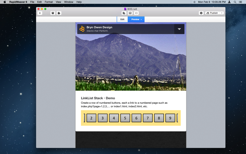
Example 2: a list of buttons that scroll horizontally (but you can also set this to responsively wrap, creating a nice grid effect!) Note that the first two examples use different parameters in the URL, and they can be configured to “know” about each other: try selecting different numbers for this example and the one above …
LinkList Info
LinkList Features
- Responsive
- PHP required
- Sparkle updates
Purchase LinkList
- $5 USD via PayPal
- Immediate download *