
FlexTable Stack
A highly flexible and responsive table Stack, capable of generating arrays of Stacks, Text entries, or based on a CSV spreadsheet.
The latest Responsive update added tons of new features including One Record and Single Column mode for mobile screens. Plus new Pager and Search features great for large tables. A responsive caption tab can also be added.
How does it work?
The HTML <table> is used and javascript manipulates the layout responsively, reshaping, re-ordering, and re-formatting the table and contents for mobile screens.
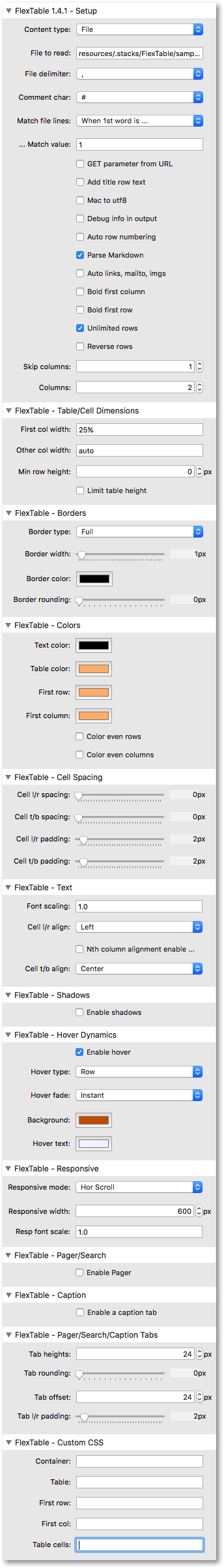
Parameters | |
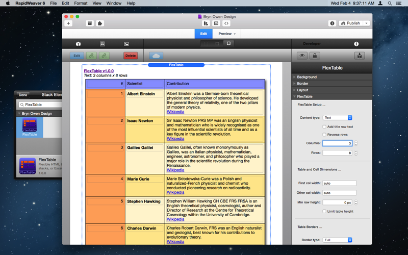
| Content type | Select the type of table content container: Text requires simply editing the text fields provided; Stack requires dragging stacks into the table; File (requires php) reads lines from a CSV file specified below. CSV files may contain Markdown. Note: for Text/Stacks, if your table is larger than 50 cells, consider using a CSV File instead. |
| File to read | Provide a relative file path or a complete url (containing http: or https:) to a CSV format file from which to read non-blank, non-comment (starts with # or character selected below) lines, showing only the first n columns (and only lines that have at least that many columns) and up to the number of rows specified below. Files are automatically located one or two directories above if not found exactly where specified first. If a url is specified it must be complete and the file must exist. The CSV delimiter defaults to comma, but can be set below. Text may contain Markdown. |
| File delimiter | Select the CSV file delimiter, which is usually the comma but may be the semi-colon in European countries. Please check the content of your exported CSV file to see which delimiter is used, and set this to match. |
| Comment char | Choose a character that signifies a comment line when present as the first character of a line. Comment lines are ignored when the file is read. Note: since # is special to Markdown you may need to choose a new comment character when Parse Markdown is enabled. |
| Match file lines | Choose which lines of the file will be used to generate the table. By default All lines are used without regard to their content. You may choose to filter only those lines whose first, second, or last display column (nth) word/number matches certain criteria. ie: 1st and 2nd refer to the first and second data columns in the original file, whereas nth refers to the last column displayed in the output table, not the last entry in the lines of the file. |
| ... Match value | Use this field to specify a word or value that is used to filter the File, based on the setting above in Match file lines. When Match file lines is set to All lines, this field is ignored. This may be the name of a URL parameter if the option below is enabled. |
| Match GET parameter from URL | Enable this to evaluate the Match value string as a GET parameter passed in the URL. For example, if the URL contains "?product=abc" then you would specify "product" as the Match value and check this box to enable searching for its value of "abc" in a column of the CSV file. This setting is ignored when Match file lines is set to All lines. |
| Add title row text | Use the first row as column titles. Note that this does not use one of the rows below, but it will affect the odd/even row coloring. |
| Mac to utf8 | Convert mac to utf8 in CSV files exported with characters such as accents etc. This is not necessary in many cases, but can be useful for Spanish language characters. |
| Debug info in output | Add debug comments to HTML output to assist with resolving problems. This is not normally necessary and should be disabled. |
| Auto row numbering | Use the first column for automatically numbering rows in the table from 1 up. Note that this uses one of the columns below so you may need to increase the Columns value and adjust the first column width to a small value if enabled. |
| Parse Markdown | Treat file contents as Markdown and convert to HTML. Note: Auto links option below is ignored when Markdown is enabled. You may need to choose a new comment line character since # is special in Markdown. |
| Auto links, mailto, imgs | Automatically generate links for words containing www. or http: or https:, and mailto links for words containing @ and period, and images for files containing http: or https: and ending with jpg, png, gif, etc. This option is ignored when Parse Markdown is enabled. |
| Bold first column | Automatically bold the first column (with strong) on the left of the output table. |
| Bold first row | Automatically bold the first row (with strong) at the top of the output table. If Add title row is enabled then this feature makes the title row bold, and not the first row of data. If Reverse rows is enabled this bolds the last row of the table. |
| Unlimited rows | If this option is enabled then the number of Rows in the table is unlimited, based on the number of lines in the File, otherwise the Rows entry below places an upper limit on the number of Rows in the table. Uncheck this before changing the Type from File back to Text or Stack! |
| Reverse rows | Renders rows in reverse order so that newly added items on the bottom of the edited table will appear at the top of the final output table. Excludes the title row if any, which remains at the top of the table. If Bold first row is enabled, the last row is bold. |
| Skip columns | Skip the first n columns of the File above when generating table output. The number of columns in the table is still set by Columns below. |
| Columns | Vertical columns in table. When Content type is File and Auto numbering is enabled, the first column is used for numbering, so you may wish to add another column for your data since this is the total number of columns in the table. When editing Text or Stack content, be sure to choose this value carefully once as it will be very difficult to change at a later date - File content is automatically regenerated by PHP each time so it is not a problem in that case. CSV File lines must contain at least this number of cells in each row otherwise they are ignored - unless the Allow fewer columns option below is enabled. Note: if your table is larger than 10 cells, consider using a CSV file instead! |
| Allow file lines with fewer columns | Normally lines in the file with fewer than the specified number of columns are skipped, but enabling this option will use these lines and not skip them. |
| Rows | Horizontal rows in table, not including title row if enabled. When Content type is File there is a checkbox above to read All lines/rows without limit, in which case the Rows setting is ignored. Note: if your table is larger than 50 cells, consider using a CSV file instead. |
| First col width | Cell width in pixels or percent for first vertical column on left only - blank is auto. Eg: 50% or 200px or auto |
| Other col width | Cell width in pixels or percent for all remaining vertical columns right of the first - blank is auto. Eg: 25% or 100px or auto |
| Min row height | Minimum row or cell vertical height in pixels, or zero for automatic. Useful for matching cell heights within the table and to other tables. See also Cell t/b padding below. |
| Limit table height | Enable a limit on the table height when checked, otherwise the default behaviour is to allow the table to grow vertically based on content. |
| Max table height | Limit maximum table height to this size and scroll vertically when content is larger. |
| Border type | Choose a preset border type. Full draws borders on all sides of every cell and around the outer edge of the table (and is necessarily double-width). Outer draws a border only around the outside of the table. Experiment with other option values to get the styling needed. |
| Border width | Internal border width in pixels. Outer border color can be controlled by generic settings above. |
| Border color | Internal table border color, for lines inside the table. Outer border can be controlled by generic settings above. |
| Border rounding | Border radius in pixels. Try increasing Cell l/r spacing or Cell t/b spacing below for better effect. Note that the outer table border will not round properly when cells are not spaced apart. |
| Text color | Color of text in table. Default color is used when this is set to match the main Table color below. Hover effects below can also set text color. |
| Table color | Background color of main table body. Set Text color above to match this if you want Text color to be ignored. |
| First row | Background color of first row. Inactive if matched to main table color; match this color to the main Table color above if you are seeing unwanted coloring in the first row. |
| First column | Background color of first column. Inactive if matched to main table color; match this color to the main Table color above if you are seeing unwanted coloring in the first column. |
| Color even rows | Check this to enable coloring of even rows. You may get unusual results combining this with even column coloring! If the first column coloring looks incorrect, change it to match the main Table color above. |
| Even rows | Background color of even rows. |
| Color even columns | Check this to enable coloring of even columns. You may get unusual results combining this with even row coloring! |
| Even columns | Background color of even columns. |
| Cell l/r spacing | Internal horizontal cell spacing, as a gap between cells in x. A value of 0 for this and t/b spacing below collapses cells to prevent double-width internal borders. A non-zero value enables the Border rounding above. |
| Cell t/b spacing | Internal vertical cell spacing, as a gap between cells in y. A value of 0 for this and l/r spacing above collapses cells to prevent double-width internal borders. A non-zero value enables the Border rounding above. |
| Cell l/r padding | Internal horizontal cell padding or space inside each cell to its left/right edge. |
| Cell t/b padding | Internal vertical cell padding or space inside each cell to its top/bottom edge. |
| Font scaling | Scale all table text using ems, where 1.0 is default. Use the responsive scaling below to change size for mobile screens. |
| Cell l/r align | Align cell contents horizontally. Alignment during text edits wins over this setting. |
| Nth column alignment enable ... | Check this to enable custom text alignment in any selected column. |
| Nth column | Choose which column to custom align. This is used inside a css nth-child() expression to choose the column td cells, so you may use a constant column number such as 2, 3, etc. or an expression like n, 2n+1, etc. |
| Nth col align | Set alignment of one specific column. |
| Cell t/b align | Align cell contents vertically. |
| Enable shadows | Check this to enable shadow controls. Note that table padding is increased automatically so that shadows are not clipped. |
| Shadow color | Color of drop shadow. Fade this color to dim the shadow instead of using blur below. |
| Shadow size | Size of shadow in pixels beyond the default cell size. 0 is default size, resulting in shadows the same size as the table or cell. |
| Shadow blur | Size of shadow blur in pixels. 0 is sharp and not blurred. |
| Shadow l/r offs | Shadow horizontal offset in pixels. |
| Shadow t/b offs | Shadow vertical offset in pixels. |
| Enable hover | Check this to enable mouse hover coloring. |
| Hover type | Select the scope of mouse hovering on table rows or individual cells. |
| Hover fade | Choose a hover effect: fade to the hover colors, or instantly change. |
| Background | Color of cell background during mouse hover. |
| Hover text | Color of text in cell during mouse hover. |
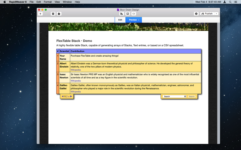
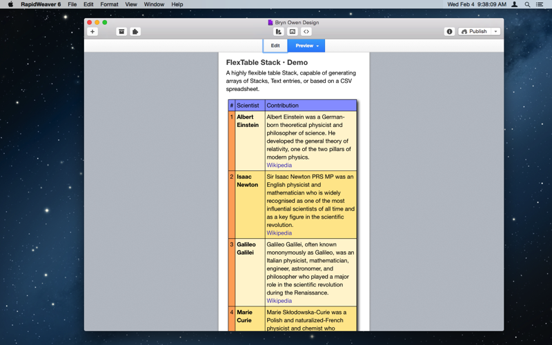
| Responsive mode | Enable responsive styling for the table by adjusting the table appearance based on screen size. Hor Scroll (the default) simply scrolls the table horizontally for large content; Ver Column converts rows into columns and creates one large single column of entries; One Record displays a single table row at a time, formatted as a record entry of one column of header info, and one column of data (you must enable the Pager below). |
| Responsive width | Client width below which responsive behaviour begins. |
| Cell gap | Extra vertical column cell spacing in pixels. When a table is responsively changed to a single vertical column, this spacing may be inserted between cells for a nice effect. |
| Resp font scale | Responsive font scaling to use on top of font scaling above, when screen width is below the responsive width. This setting allows you increase or decrease the size of the text in tables for mobile screens. This value is multiplied against the font scaling setting above to compute the overall mobile font scaling. |
| Enable Pager | Check this to enable the Pager, showing only a portion of the table and adding Pager buttons. This also enables the option to search the entire table. You must enable this option when using responsive Record mode, otherwise only the first record will ever be shown! |
| Pager on top side | Check this to move the Pager tab to the top of the table instead of the bottom. |
| Pager arrows wrap | Disable this feature if you want the Pager left/right arrows to stop working when the first or last page is reached. By default, when this feature is enabled, the arrows will wrap around to the first or last page when clicked. |
| Pager style | Choose a style for the Pager arrows etc. Experiment with this setting and view results in Preview. |
| Rows/page | Set the number of rows from the original table shown per page of the displayed table. If you want to disable the Pager set this value to more than the number of rows in your table, or a very large number - the Pager will disappear. Set the responsive Pager rows/page below to then re-enable the Pager on mobile screens. |
| Rows/page resp | Set the number of rows from the original table shown per page of the displayed table, when a small screen size is detected. Usually this would be a small number compared to the rows/page of the non-mobile Pager set above. In record mode this is automatically set to 1 row per page, so no need to edit this value. |
| Consecutive num | When there are many page numbers, the Pager will hide some resulting in 1 2 3 ... 7 8 9 ... 13 14 15. This control specifies how many consecutive numbers to show at minimum. All means page numbers will not be hidden, but this may not work when there are many pages. None means that Pager links will be disabled and only the arrows will be available with the current page number. The + link will always be available to show all rows of the table without paging. And the - link can be used to reset back to paging (also after a Search). |
| Pager color | Color of the Pager tab background. |
| Pager hover | Color of Pager background when it is being used or the mouse hovers over it. Set this to the same color as the pager background to disable the hover effect. |
| Pager text hover | Color of text in Pager during mouse hover. |
| Enable Search | Check this to enable searching the table, and adding a Search box, as long as the Pager is enabled. Search is not available without the Pager. |
| Search button | Set the text in the Search button and placeholder text in the search field. The default is Search, but you can set it to any language or string necessary. |
| Search on top side | Uncheck this to move the Search tab to the bottom of the table instead of the top. |
| Search color | Color of Search tab background. |
| Search hover | Color of Search background when it is being used or the mouse hovers over it. Set this to the same color as the search background to disable the hover effect. |
| Search width resp | Resize the search input text field to this width in pixels for mobile screens. |
| Hide Search below width | Check this to automatically hide the Search tab when the screen size is small for mobile. |
| Enable a caption tab | Check this to add caption text box to the top or bottom of the table. |
| Caption on top side | Check this to move the caption tab to the top of the table instead of the bottom. |
| Caption is full table width | Enable this for a caption that spans the entire table width. When this is disable, the caption is a tab like pager and search, and can be hidden responsively when the screen size is small for mobile. |
| Caption align | Text and tab alignment of caption. This setting sets the caption text alignment inside a full width caption, and also the tab location relative to the Pager and Search tabs otherwise. |
| Hide caption below width | Check this to automatically hide the caption when the screen size is small for mobile. |
| Caption string | Add this caption to the bottom of the table and style it. |
| Caption color | Color of caption background. |
| Caption text | Color of caption text. |
| Caption italics | Check this to change caption font to italics. |
| Caption bold | Check this to change caption font to bold. |
| Tab heights | Set the height of Pager, Search, and caption tabs so they all match. |
| Tab rounding | Border radius in pixels. This rounds the outer edges of the tabs where they do not meet the table, unless t/b spacing permits. |
| Tab offset | Set the edge spacing and spacing between Pager, Search and caption tabs so they do not touch each other. |
| Tab l/r padding | Extra padding of Pager, Search and caption tabs on the inside l/r edges. |
| Container | The div within the Stack that the entire table and tabs etc. sit within. |
| Table | The main table that sits within the container div. |
| First row | First row of table, applies to td elements in first row tr of table. |
| First col | First column of table, applies to td elements in first position of each row tr. |
| Even rows | Even rows of table, applies to td elements in table. |
| Even cols | Even columns of table, applies to td elements in table. |
| Table cells | The main table td elements inside all rows. |
| Cell paragraphs | Paragraphs inside the main table td elements inside all rows. These are present when using Markdown. |
| Pager | The pager span element that sits in the container div. |
| Search | The entire search form element. |
| Search field | The search form text input search field. |
| Search button | The search form input button. |
| Caption | The caption span or div element that sits in the container div. |
Check out examples of FlexTable - this is a killer stack with TONS of possibilities, and dynamic behavior, so you'll find only a few of the many options demonstrated below …
Example 1: a table of Text fields, 3 columns x 5 rows …
| Edit | Edit | Edit |
| Edit | Edit | Edit |
| Edit | Edit | Edit |
| Edit | Edit | Edit |
| Edit | Edit | Edit |
Example 2: a different border style and alternating row colors, with additional colors for first row and column …
| Edit | Edit | Edit | Edit |
| Edit | Edit | Edit | Edit |
| Edit | Edit | Edit | Edit |
| Edit | Edit | Edit | Edit |
| Edit | Edit | Edit | Edit |
Example 3: a table with shadows, transparency to a background, hover effects, and fade, and responsive text scaling and caption hide …
| Edit | Edit | Edit | Edit | Edit |
| Edit | Edit | Edit | Edit | Edit |
| Edit | Edit | Edit | Edit | Edit |
| Edit | Edit | Edit | Edit | Edit |
| Edit | Edit | Edit | Edit | Edit |
| Example of a 5 x 5 blank table |
Example 4: large tables can have a Pager and Search box, even a Caption - these all behave responsively, so stretch that browser! The Pager, Search, and Caption all have many options for styling, coloring, borders, and location and size, so the table below is just one example …
| Responsive Example |
| Number | Stack | Features | Price |
| 1 | FlexTable | Responsive, Pager, Search, Caption | $8 |
| 2 | RandomQuote | Read from CSV file or text edit region | $5 |
| 3 | FlexCanvas | Generate thousands of shapes, gradients, logos, text | $5 |
| 4 | RandomStacks | Multiple options for random quantity, order, and selection | $4 |
| 5 | WinMac | Detect client operating system and show content accordingly | $3 |
| 6 | ShowHide | Detect browser width and show or hide content | $3 |
Example 5: tables can be Stacks as well, not just Text, and table cells can be spaced apart …

| 
|
| 
|
Example 6: tables can be populated with CSV spreadsheet content, and more than one table can use the same file …
In the first table below, only lines where the first column of the CSV file is 1 are shown, and that column was skipped so it does not appear in the output …
English | Hello |
French | Bonjour |
Spanish | Hola |
In the second table, lines where the first column in the CSV file is 2 are shown …
| English | One |
| French | Une |
| Spanish | Uno |